Picking the Perfect Color Palette for Your Furnishings
Picking the right color palette for your facility and its furniture is important in any industry, but there’s more to it than just pointing to your favorite on a color wheel. Though it’s not always a high priority when shopping for furnishings, color has the ability to evoke immediate emotions in customers, patients, and residents—making it a valuable asset to you and your business.
What You Need to Know About Color Psychology
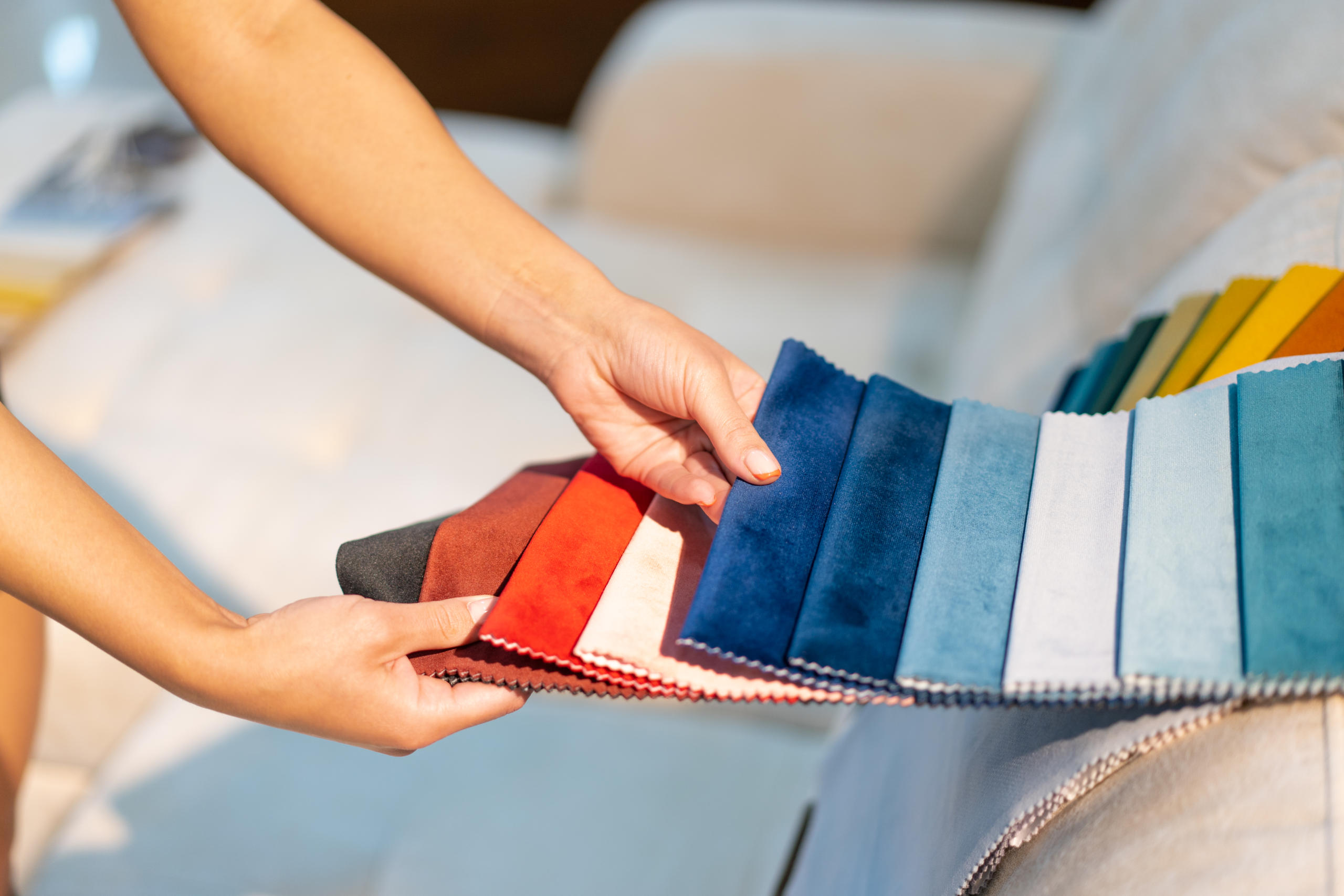
From the products we use to colors on our walls and the food we eat, colors directly affect our behaviors and purchasing decisions every day. To help you decide which colors will work best for your business’ furnishings, we’re diving into the art of color psychology. Each color represents specific emotions or holds a common meaning among consumers, so let’s start with the basics:
Primary Colors
- Red is often used to draw attention to a certain object or encourage someone to take a specific action (picture a stop sign). It can evoke feelings of love, danger, passion, and strength, depending on the context it’s used in.
- Yellow is one of the brightest colors on the spectrum, making it a great choice promoting happiness and releasing serotonin chemicals in the brain. It’s also good for inspiring creativity, confidence, and feelings of warmth.
- Blue promotes feelings of freedom, wisdom, peace, and trust. An extremely versatile primary color, it can also enhance the depth of a room when used in interior design and create a sense of loyalty, tranquility, and stability.
Secondary Colors
- Orange is similar to yellow in that it’s a vibrant color that evokes confidence and creativity. It can be used to motivate people, invite success, and create warm, comforting environments.
- Green is extremely representative of natural elements and emotions, such as energy and growth. Because of its connection to life and wealth, the color green is popular in the health and financial industries.
- Purple represents luxury. It may surprise you to learn that purple has been unofficially deemed the color of royalty by many. Its ability to evoke feelings of power, nobility, and spirituality gives it an almost magical attribute (when used in the right setting).
Common Colors in Your Industry
When it comes to furnishing your facility, a good rule of thumb for making smarter decisions is to start by asking yourself: what do I want the people who use this furniture to feel? To help answer this question, let’s look at a few growing industries (that we just so happen to serve)…
Schools & Universities
The best way to help students succeed is by creating comfortable, inviting live-learn environments. According to one architecture and design firm, “when making interior design choices for a school setting, the goal should be to seek a balance between over-stimulation and lack of stimulation.”
While spots of yellow may help inspire feelings of happiness and help keep students alert, it probably wouldn’t be best for a student’s dorm room (where they tend to prefer a more relaxed environment). However, yellow can be a great choice for common areas or creative spaces. For classrooms and dorm rooms, the use of blue tends to be a popular choice for its ability to create a deep sense of tranquility and calmness. Keep this tip in mind if your university is looking to change things up!
Healthcare Facilities
It’s no secret that healthcare facilities use a lot of whitespace in their design. From their floors to their furniture, the use of white tends to represent a sense of cleanliness (which can make people feel safe). On the other hand, overusing whitespace can make a room feel cold and empty.
If you’re looking to uphold a clean, crisp atmosphere but add in pops of color for personality, consider a few green or light purple furnishings for your facility. For obvious reasons, green furniture is great for adding a touch of “life” to any room. It can work wonders in making patients and residents feel naturally energized and ready to conquer their health concerns. Similarly, with its subtle connection to spirituality, certain shades of purple may also be calming for those going through a stressful healthcare situation.
Hotels & Resorts
Much like healthcare facilities, greens and purples can be a great choice for accent pieces in a hotel bedroom where guests expect to unwind. But because of this, it’s important to note that they’re also fairly common in this industry.
If you want your hotel or resort furniture to stand out, try mixing in brighter colors, such as yellow or orange. While these may be a bit overwhelming to guests trying to sleep after a long day, they can be strategically placed in common spaces (like lobbies or recreational areas) to reinvigorate guests and keep them feeling positive and energized during their stay.
Rest easy… The Smarter Way.
Your furnishings are a reflection of your business as a whole, and you want that reflection to be a positive one. As your dedicated furniture provider and business partner, we’re here to help you rest easy throughout the entire process. For many of our customers, that means helping them decide which collections or products will set the right tone for their facility and those in it.
Let’s meet! We offer livestream demonstrations from our showroom or in-person presentations at your convenience. Give us a call at (205) 621-2502 or contact us online today.